Today I bring you a GORGEOUS kitchen belonging to Carlyn Henry, her husband and two young sons. Carlyn lives in the tony neighborhood of Cheviot Hills here in L.A.. This kitchen remodel came to me via talented Los Angeles architect Tom Newman and incredible contractor Gregory Greenwood.
I'm going to try to make a short story short...although if any of you actually read my ramblings on the blog on a regular basis you know that I tend to make all short stories very long. When in college, best of friend AM and dear friend AO and I called the syndrome of blurting out too much information, Over Sharing Syndrome (OSS). I have OSS - clearly.
Anyhoooo...a few weeks ago architect Tom emailed me about a kitchen he and contractor Gregory just completed. At the same time, I think I got an email from my good friend Samantha Nugent (whose living room I just featured last week) saying she had a friend named Carlyn who had a gorgeous home. I know that Tom, Gregory and Samantha all have impeccable taste and I heard "gorgeous and remodel" in the same sentence and I was all over pursuing this post.
So luck would have it that very nice homeowner Carlyn Henry was gracious enough to invite me into her BEAUTIFUL home this past Saturday for a nice snoop and for some photo taking. Carlyn's home is indeed stunning. Carlyn and her family moved out of her home for months of a remodel that included a whole house face lift.
Today I am focusing on the amazing kitchen. I bring you a bit of Q&A with both home owner Carlyn and architect Tom Newman on this chic galley kitchen remodel.
Here goes...
***
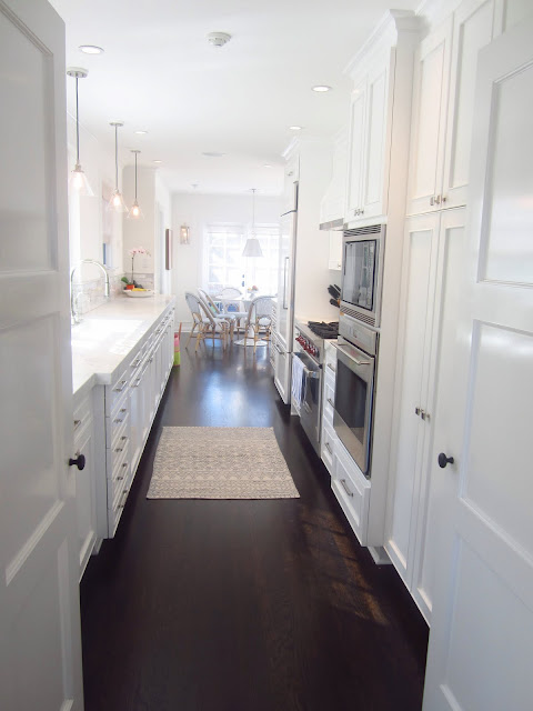 |
| The eat in galley kitchen in Carlyn Henry's home features dark wood floors and cabinets and walls painted in Benjamin Moore's Simply White. (above) |
COCO: The kitchen is stunning...what was your goal for this space?
CARLYN HENRY, HOMEOWNER (CARLYN): I thought that if everything in there was pretty and a bit decadent then the small size of the kitchen (galley vs island) would never be an issue. I wanted it to be a destination room in mood since we could not offer it in space. I also love the white on white to make the space feel bigger. And the heavy repetition of the hardware and cabinetry elongates the room. We purposely did not add upper cabinets on sink side to give the kitchen more headroom and larger appearance. I wanted it to feel clean and elegant.
COCO: What kind of marble did you use on counters and backsplash?
CARLYN: The counters are Calcutta Manhattan and the backsplash was a tile that we picked...I am not sure of the name but the tile length is 2x8.
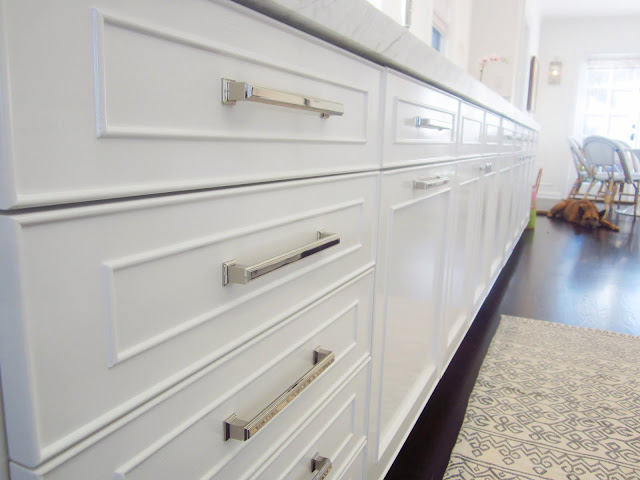 |
| Polished nickel hardware for drawer pulls and cabinet knobs add refinement to the already elegant space. (above) |
 |
| Simple clear pendant lights hang over the kitchen sink counter area. (above and below) |
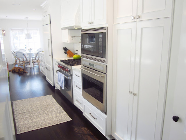 |
| This galley kitchen features everything a home chef would want...double ovens, a Wolf gas range and a high end refrigerator with panel doors matching the rest of the kitchen cabinetry. (above) |
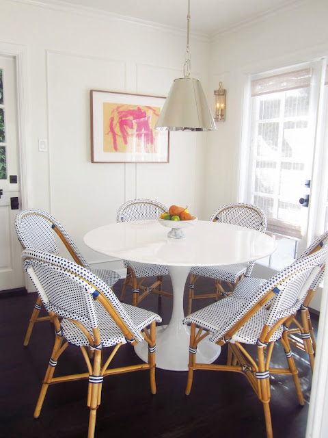 |
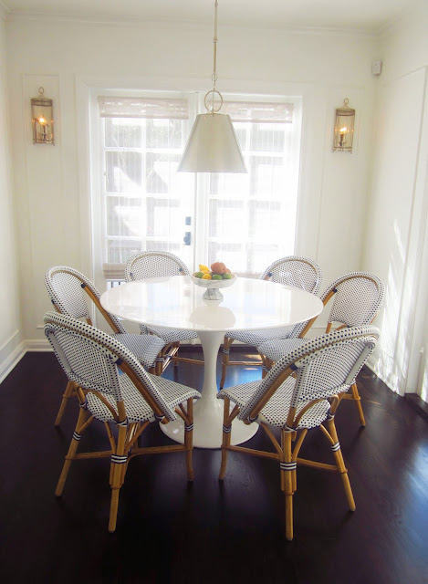
| The breakfast nook is absolutely darling with a Saarinen Tulip round table in white surrounded by blue and white French cafe style chairs. (above) |
COCO: Describe an element of the design you are most proud of?
TOM NEWMAN, ARCHITECT (TOM): Before the remodel, they had a 30” round folding table in one corner of their kitchen which is where they ate most meals; husband, wife, and two kids. Then throw in a nanny and it just seemed crazy that they lived this way. My biggest push was to add a proper breakfast room where they could all sit comfortably and be next to their back yard patio. Family dining was very big in my house growing up and I try to pass on that important institution to others. It happened and turned out great
COCO: Now that your family has moved back into the house, how do you feel about the long months of construction and design...was it worth it?
CARLYN: When the last piece went in: the breakfast table and chairs, we fell in love. We moved in 4 months before that came so moving back in was hard and the punch list was long (we pushed to move in by a certain date so a few things had not yet been completed). Now we feel like the house is totally ours and so fresh and new that we forget how long we lived in the rental apartment. It does feel worth it when it’s finally and truly done.
***
Thank you Carlyn Henry for inviting COCOCOZY into your fantastic home. It was such a thrill. So nice meeting you, your husband, adorable kids and cute dog Dallas!
Architect Tom Newman and contractor Gregory Greenwood - amazing work as usual!
Readers, what do you think of this galley or shotgun kitchen? Is there anything here you would just love in your own kitchen? I would just take the whole thing!
Happy Tuesday!
xo
Coco
P.S. Saturday's tour of Carlyn's house was especially nice because Samantha Nugent and her cute daughters came by to tour with me. The little girls 3 and 7 I think and they were both dressed in pink. Such cuties.
P.P.S. Did I ever update you on that possible big corporate gift order? A major entertainment company is ordering our signature COCOCOZY Logo throws from the COCOCOZY Textiles collection as their corporate gifts for all of their top people and on-air talent! We are so thrilled.
P.P.P.S. Remember to follow COCOCOZY on Bloglovin'! Also, I put a cute photo on COCOCOZY Instagram and COCOCOZY Twitter last night. Take a look and let me know what you think!
P.P.P.P.S. Just finished up the designs for the COCOCOZY 2013 textiles collection. Can't wait to share them. We are getting strike offs in the next few weeks. 2013 is going to be a busy one for us...we have several new partners and lots of different product launches...including the whole bedding line and more. So much to do...so little time...!
P.P.P.P.P.S. Remember how a few weeks back I said I liked lighter wood floors. That has changed. After seeing Carlyn's home and kitchen, I am now thinking I'm back in love with dark wood floors for my little tiny cottage in the Hollywood Hills. Hmmm...all of this floor indecision has meant nothing has gotten done at my house!!! Help!!!!!
All photos in this post by Coco of COCOCOZY





0 comments:
Post a Comment